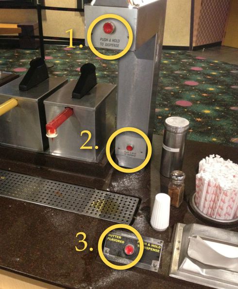
I am fascinated by service providers who try to shape behaviors with customer-facing job aids (like this one at the Westin Copley Place or this funny one in a restaurant bathroom). Service providers experience what they perceive as a stupid question or a customer not doing what "they are supposed to do," so the first solution they jump to is to create a sign to dictate behavior. Bravo to AMC Theaters which took a more customer-centric approach. Instead of a condescending sign, they added design redundancy on their butter dispenser with three different buttons making it easier and quicker for customers to figure it out.
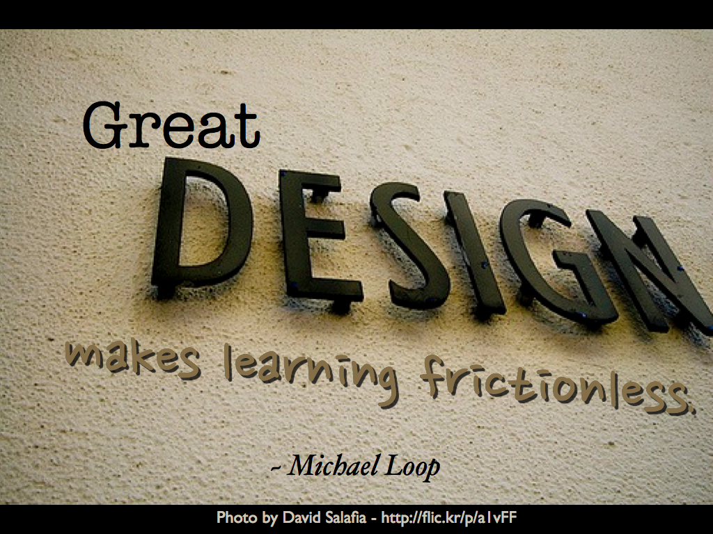
Next time you're munching on some buttery popcorn, remember to consider design as the first solution as opposed to adding more instructions and directions. Michael Loop states it well in his recent post Two Universes | Design Well-Informed Improvisation.
What other customer-facing job aids or design solutions have you seen?


